- Logo Design
- Web design
I helped the organization Grup de Natura Freixe with the rebranding of their logo andtheir website.
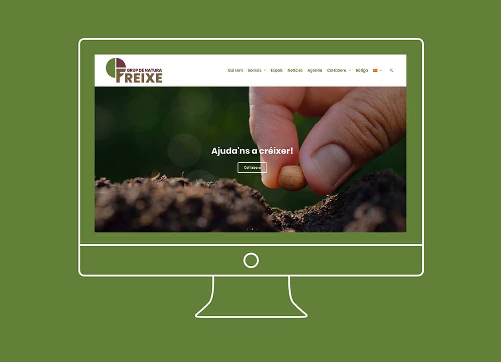
- Website built with WordPress and custom fields
- Integrated calendar for events
- Update of the brand with a new logo
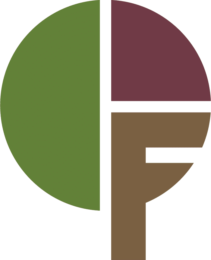
Logo design
The main idea of the logo is to unite the name of the tree “Freixe” (Fraxinus) with its concept.
I took the three main colors from the tree (green, brown and garnet) that can be related with the values of the organization and its slogan “Nature, land and people”.
- Green represents the color of the leaves and represents “Nature”.
- Brown is the color of the trunk and it represents the “Land”.
- Garnet is the color of the leaves in autumn and it represents “People”
With all this elements together, the final logo represents the natural cycle of the tree “Freixe (Fraxinus). With the green leaves on spring and summer, the garnet leaves on autumn and no leaves on winter.


Web design