Artsy Logos
Series
- Medium
- Concept, Branding, Logo design
- Made as
- Personal project
- Subjects
- Eleven artists
What if well-known artists started businesses today? What would they offer, and what would their logos look like?
In this personal series, I invented a business for each of eleven artists and designed an identity inspired by their work. Part art-history exercise, part branding experiment, with room for a joke.

Piet Mondrian
For Piet Mondrian, I imagined a data analytics consultancy. The logo translates his verticals, horizontals and blocks of colour into an identity for a business that makes complex information easier to read.
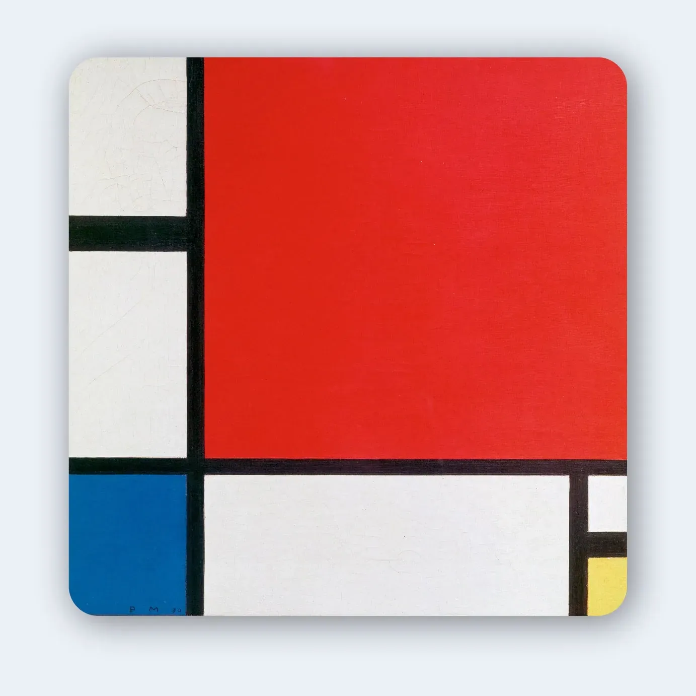
Inspired by Composition with Red, Blue and Yellow.

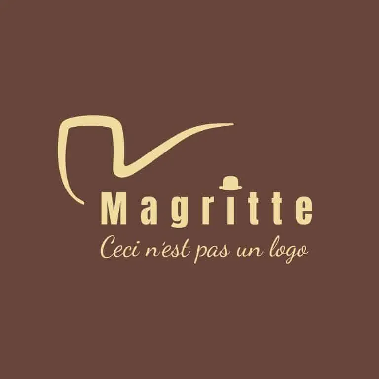
Magritte
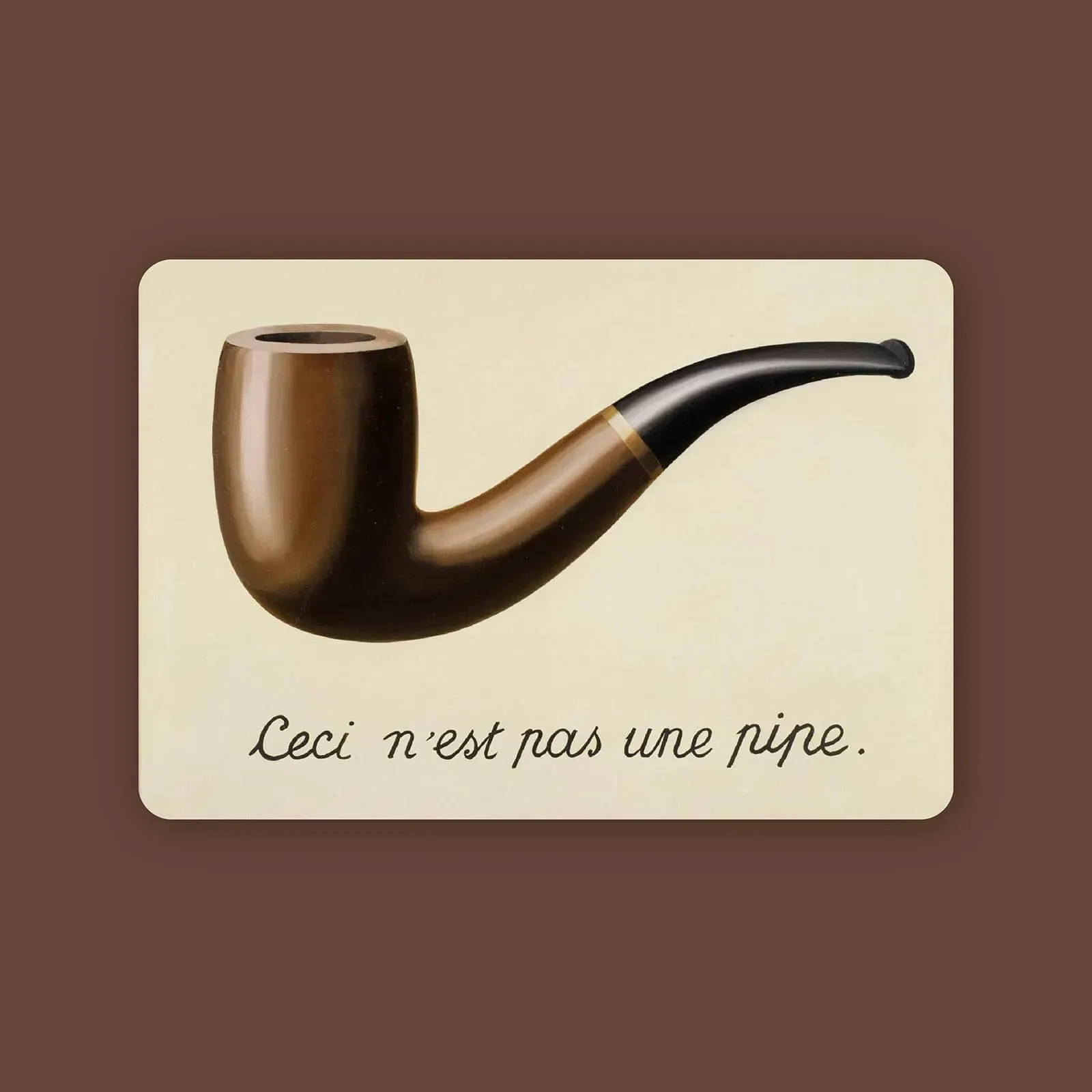
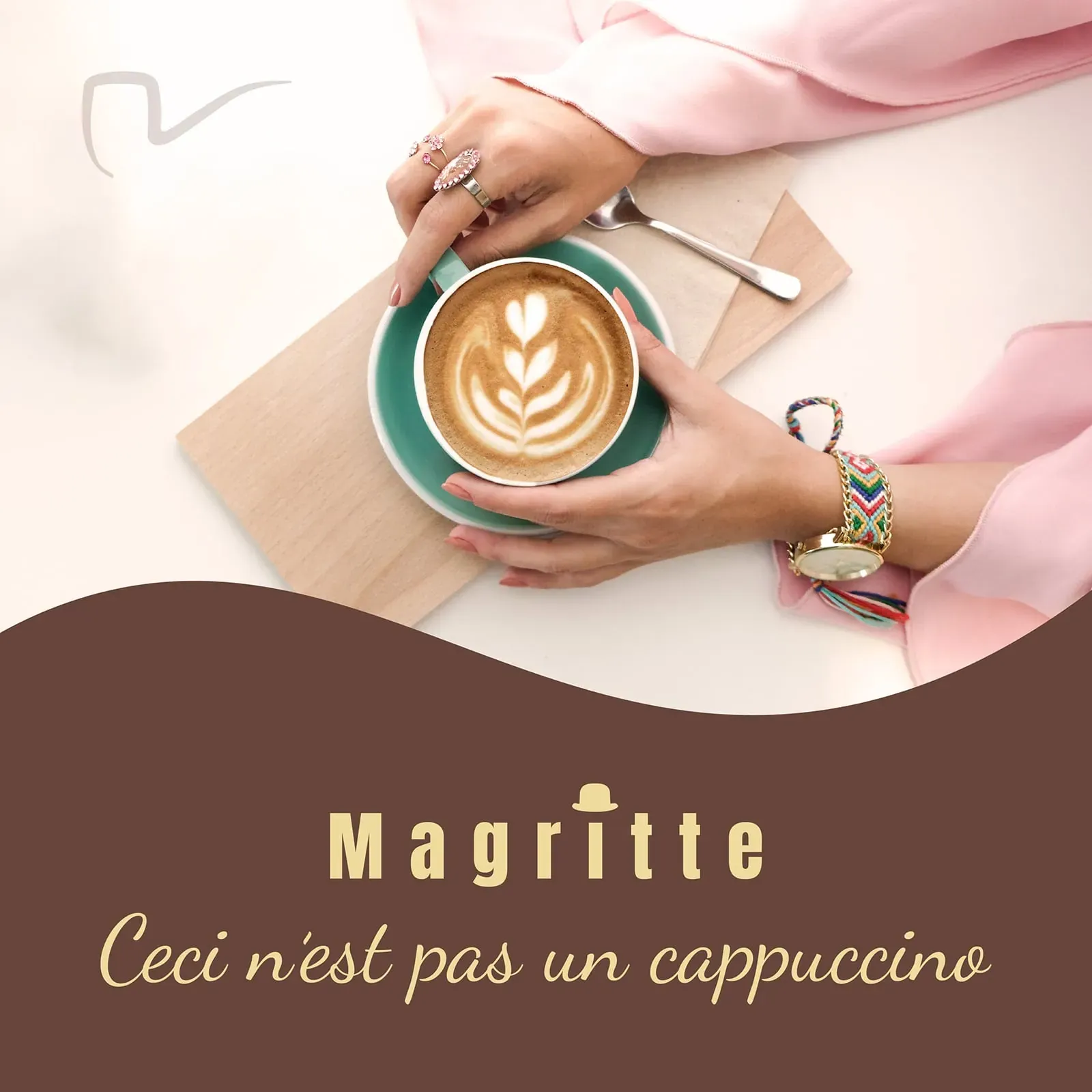
A café for René Magritte, where a pipe becomes a logo and the logo insists on being a pipe. The design plays with the gap between an object and its representation, with a bowler hat to keep the contradiction company.
Inspired by The Treachery of Images.
Marcel Duchamp
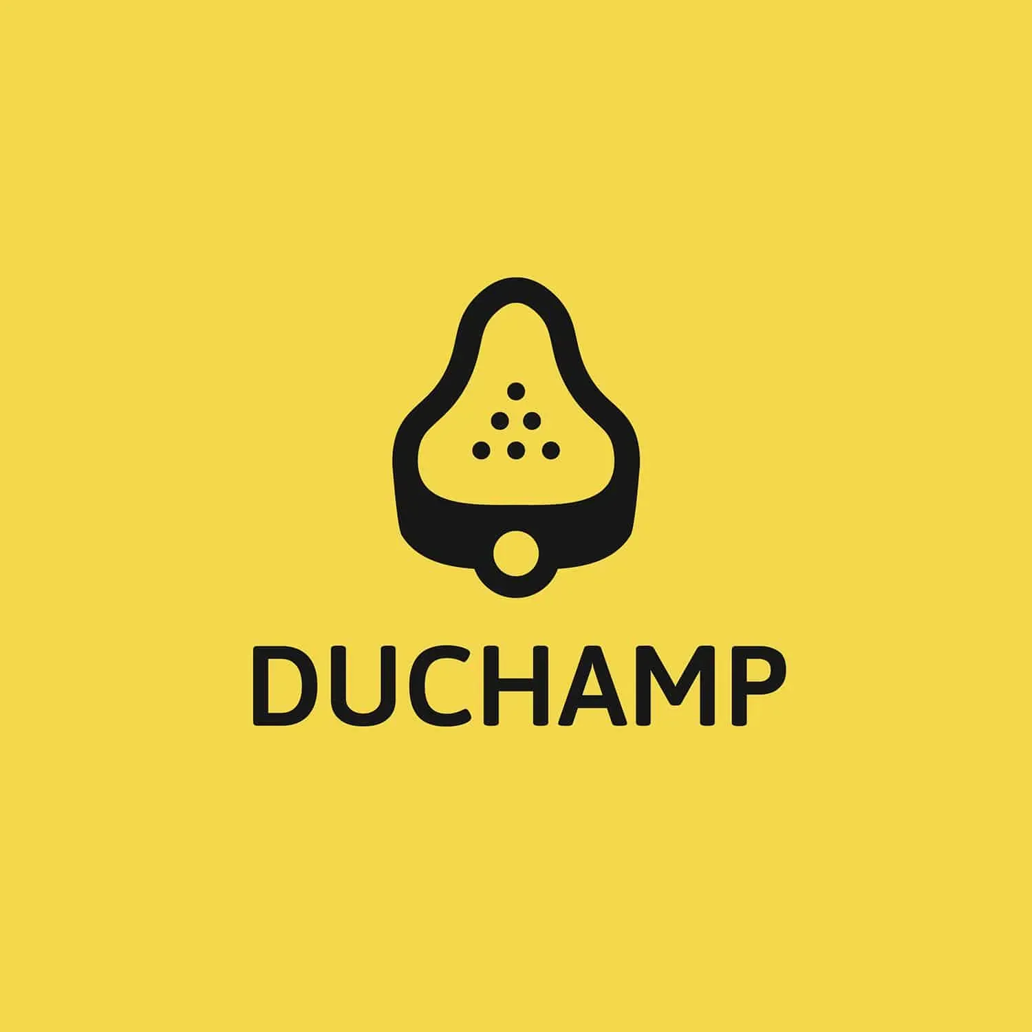
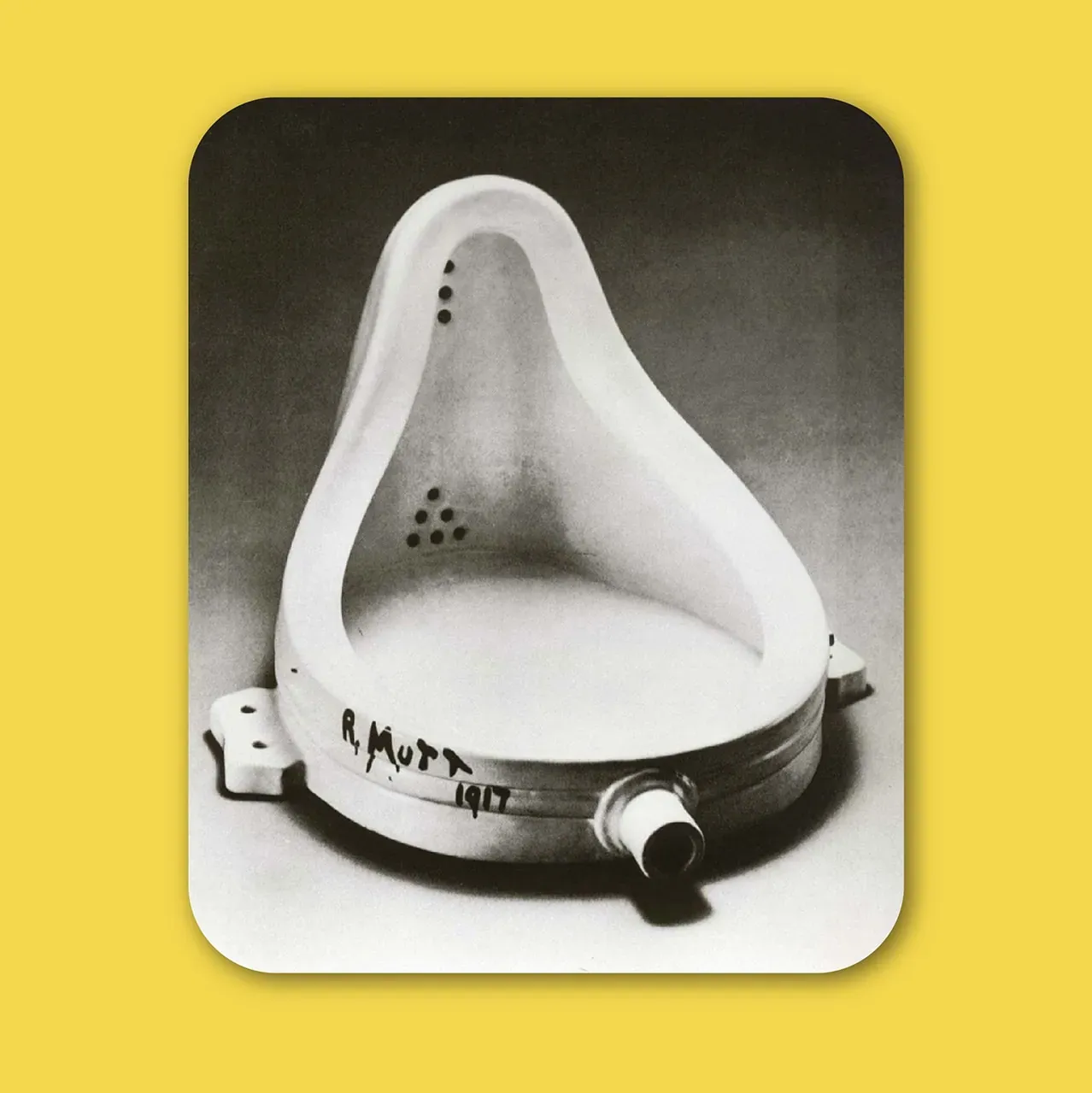
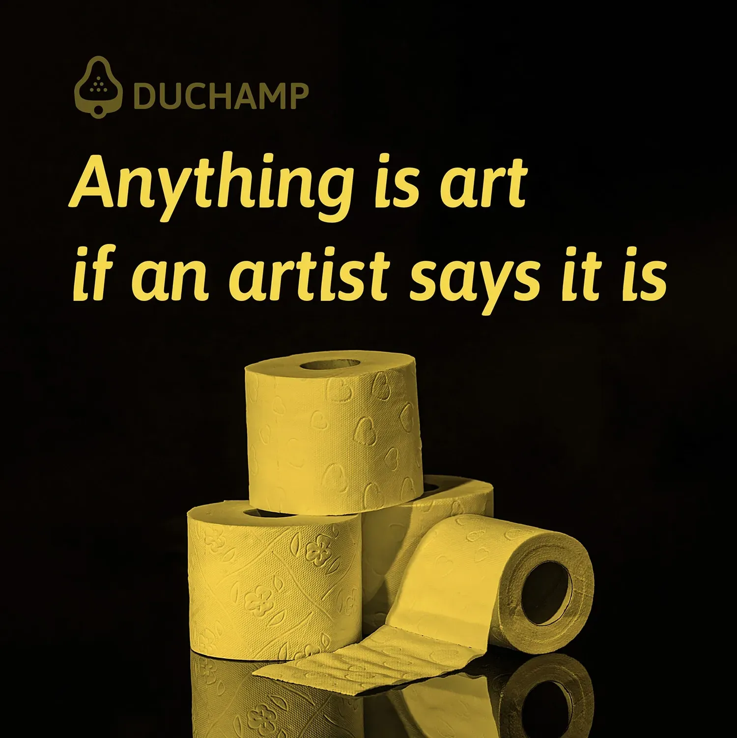
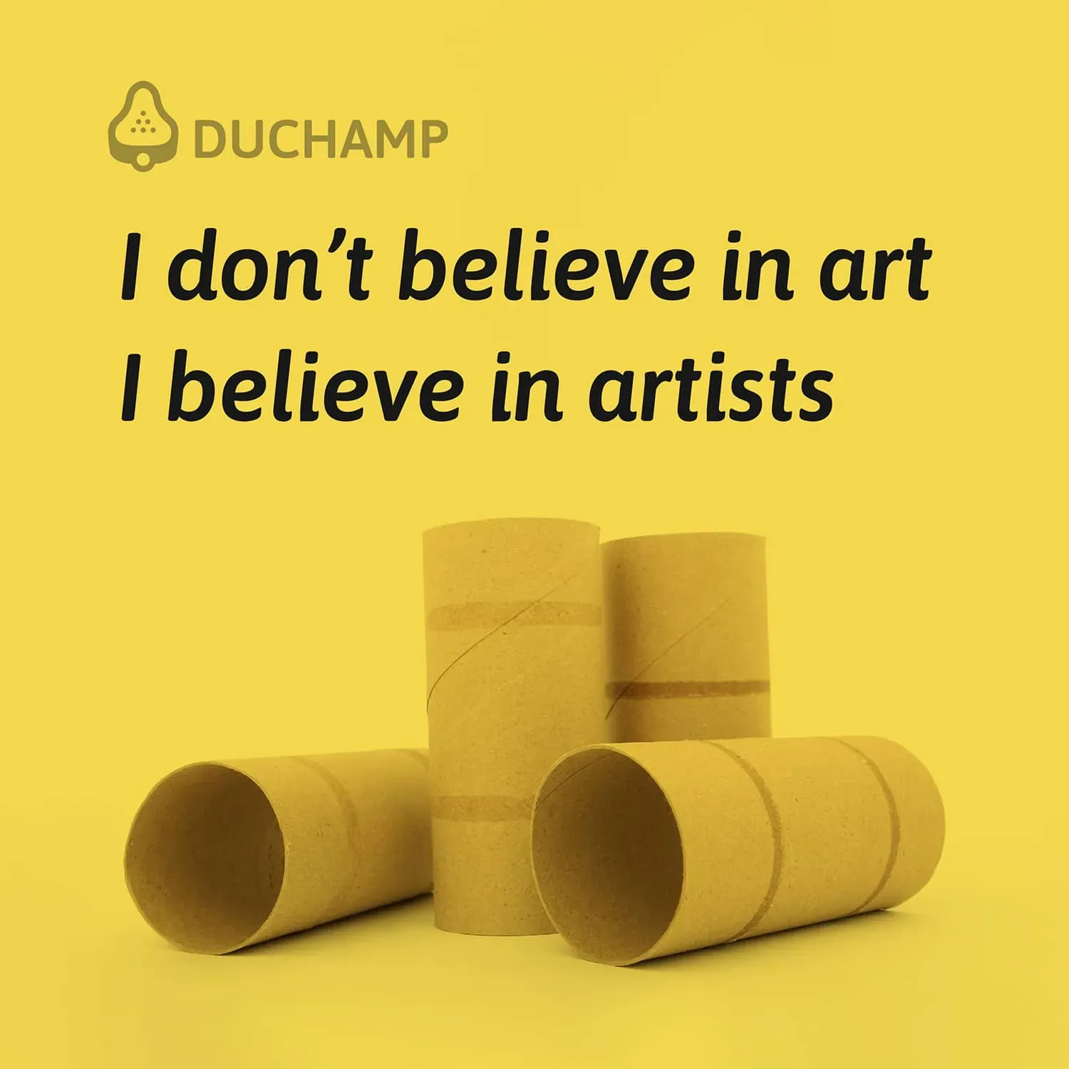
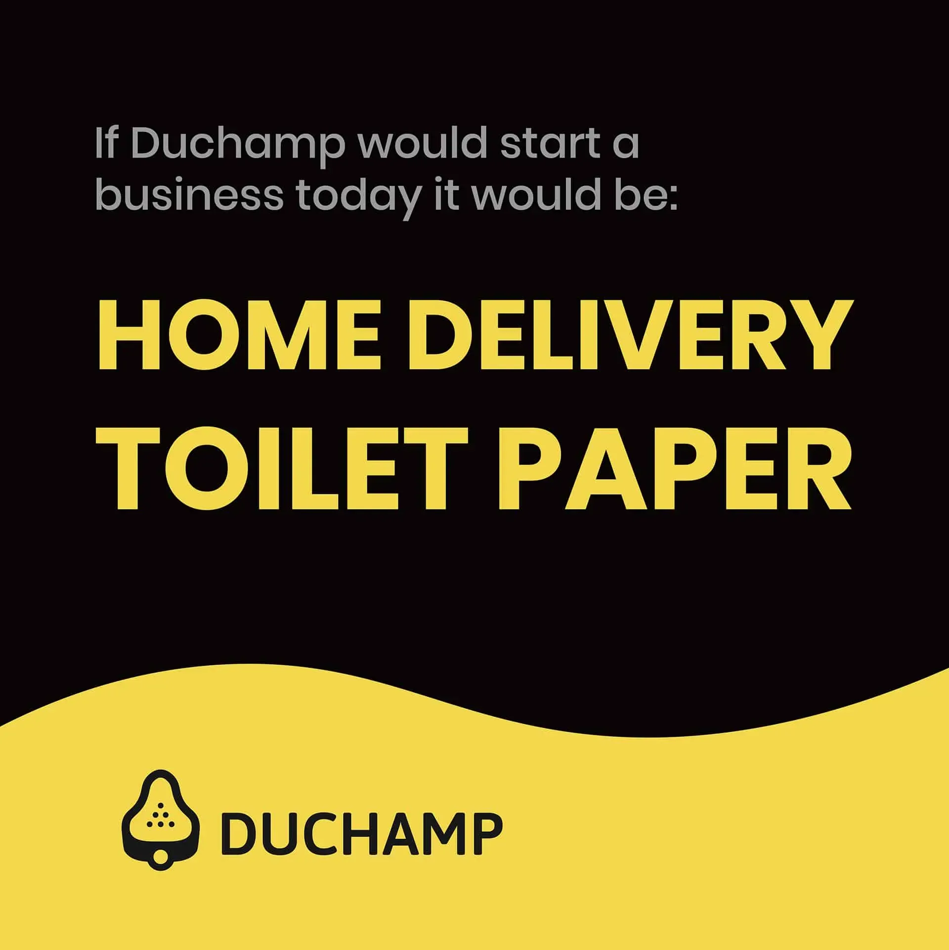
A home-delivery service for toilet paper felt like the right business for Marcel Duchamp. The logo reduces the shape of a urinal to a simple mark, taking the idea of the readymade into an everyday product.
Inspired by Fountain.
Andy Warhol
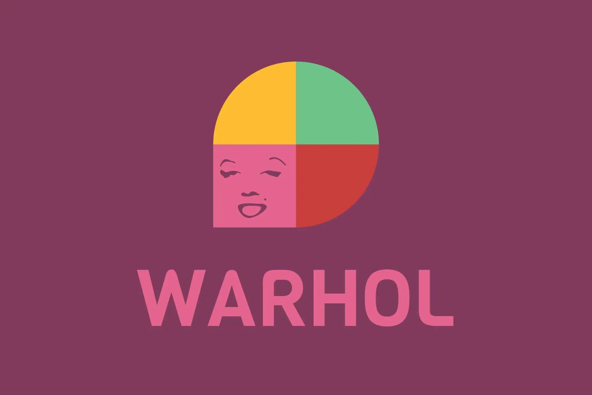
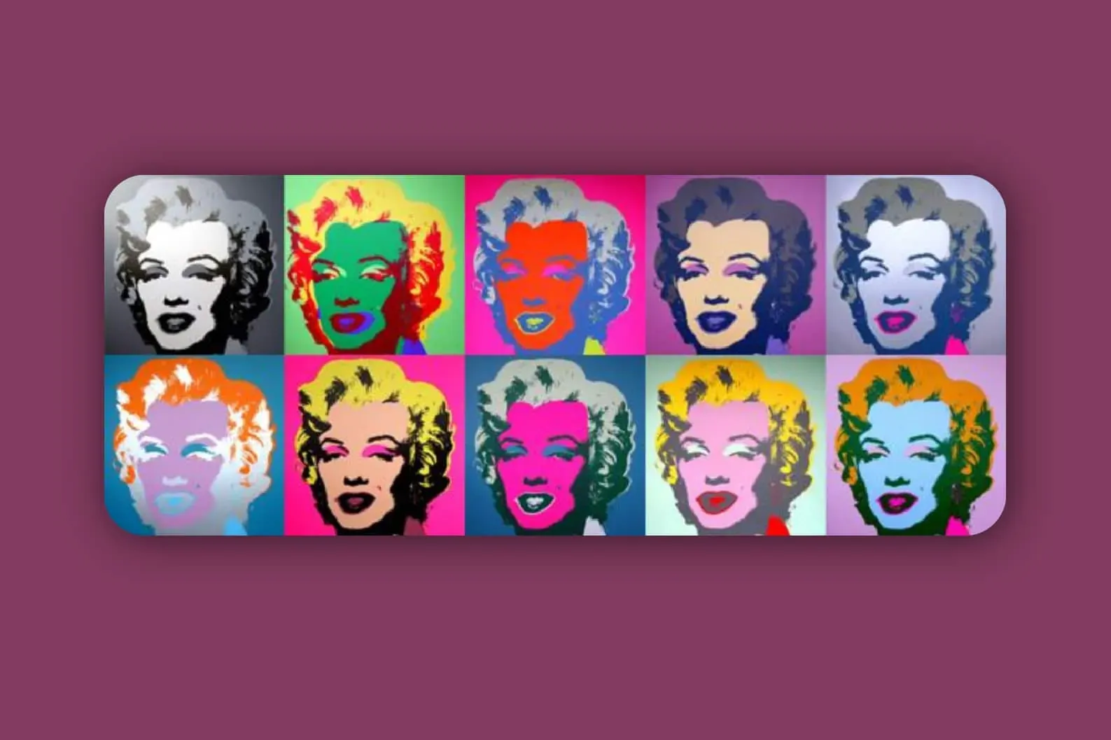
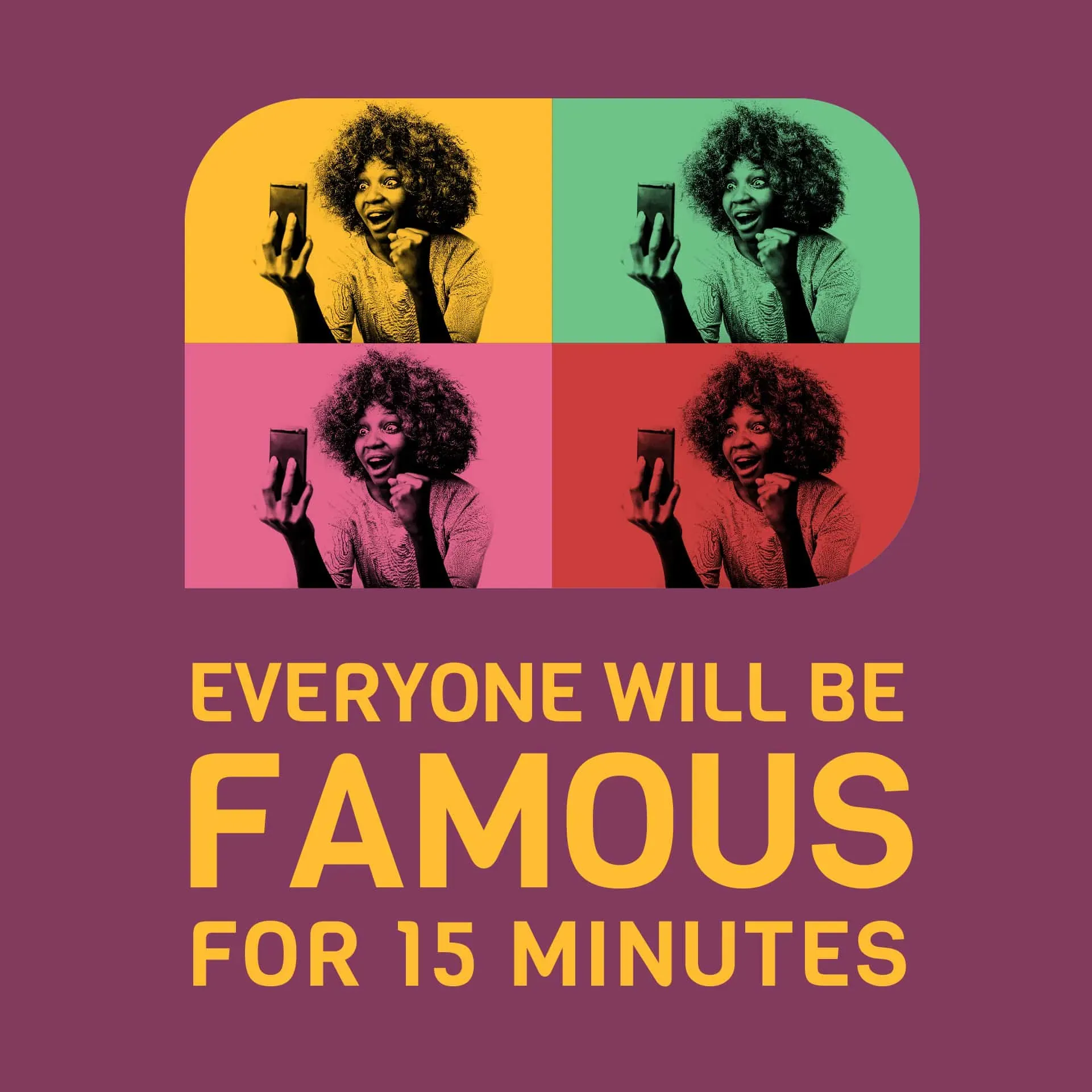
I imagined Andy Warhol launching a video chat platform, giving everyone a little screen time. The identity borrows the repetition and colour contrasts of his Marilyn portraits.

Georgia O'Keeffe
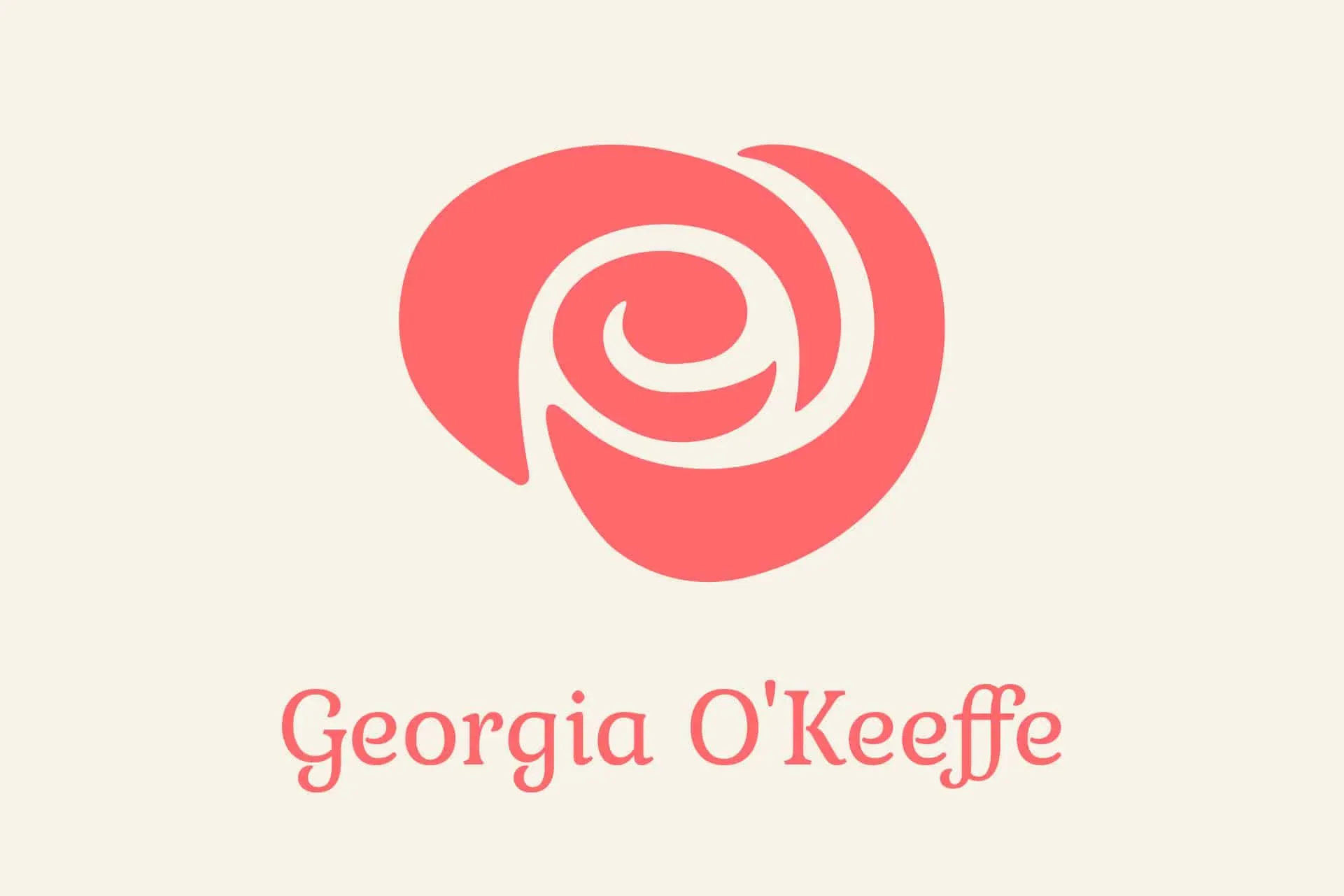
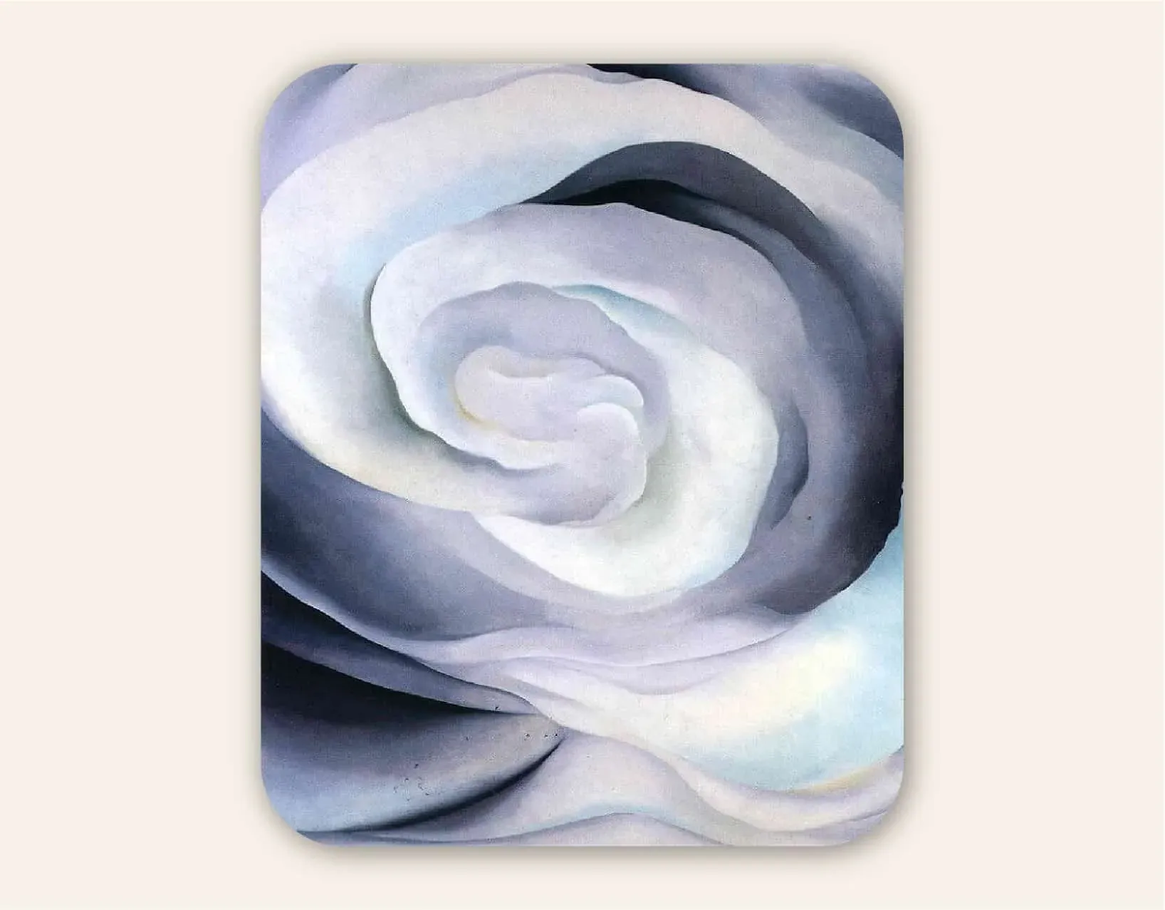
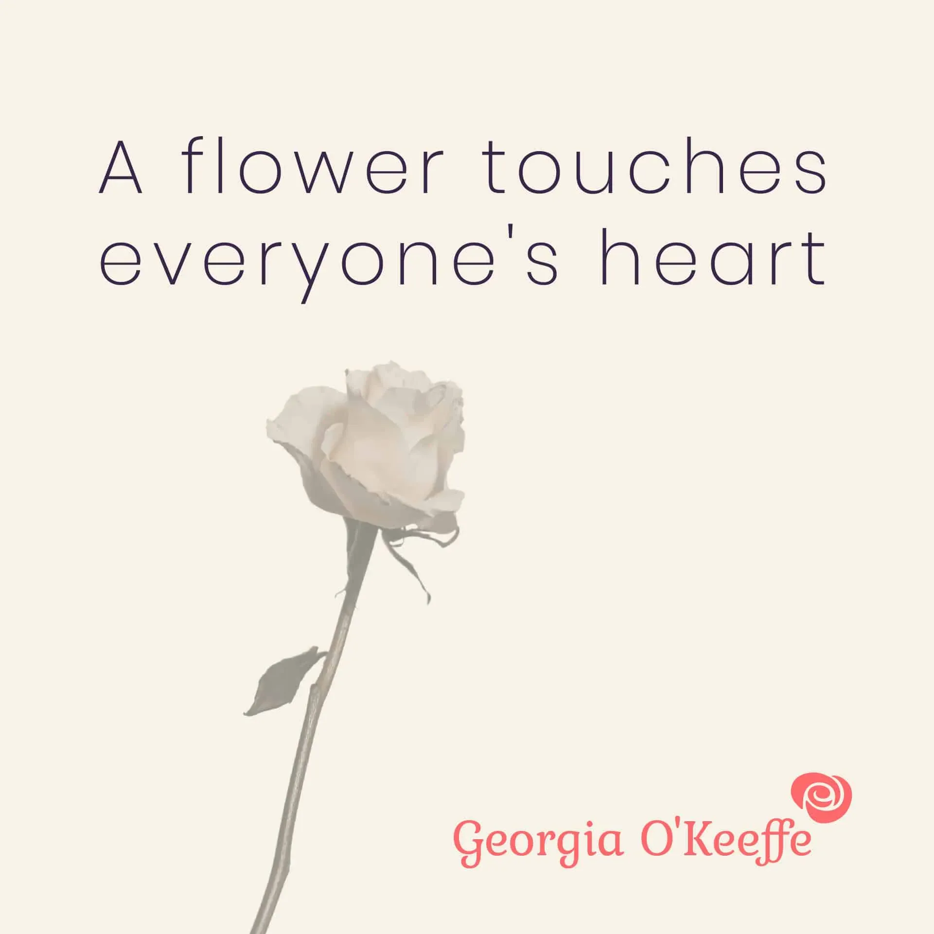
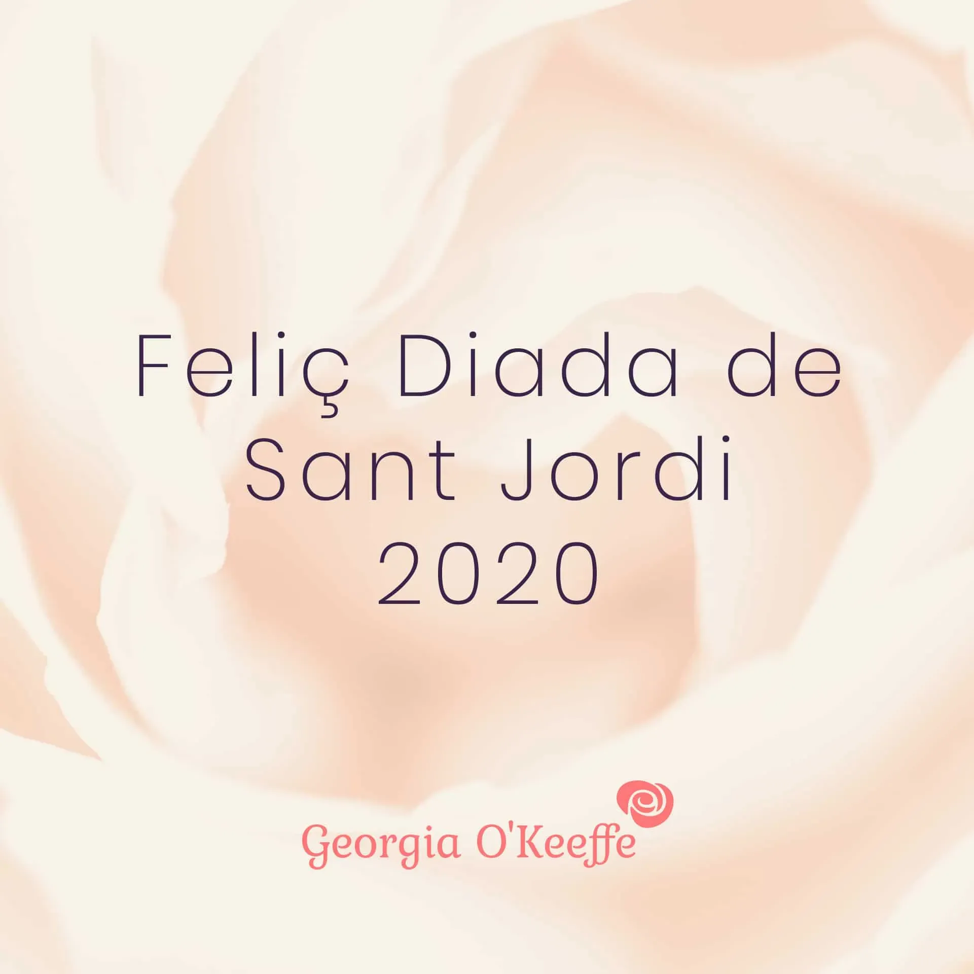
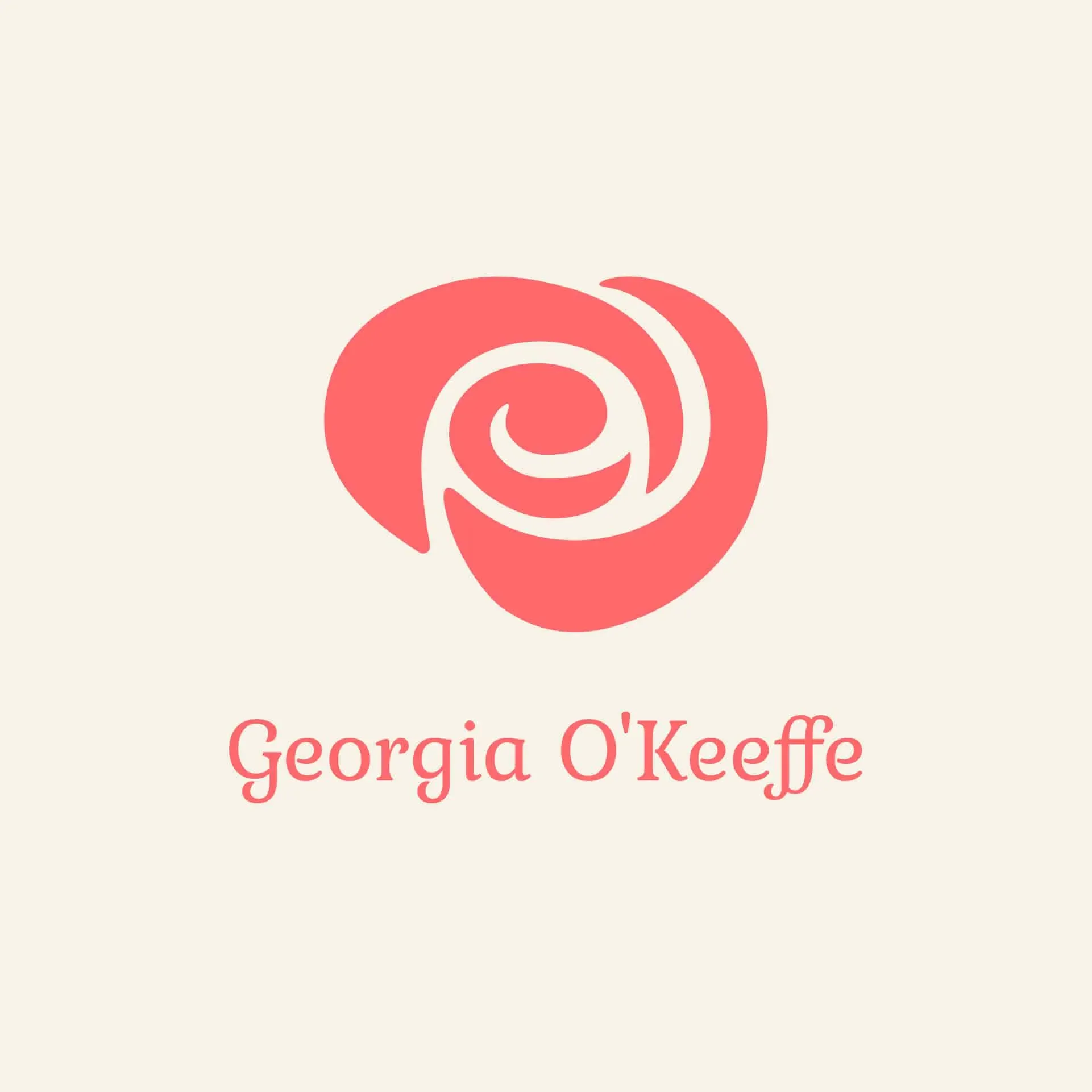
Si Georgia O’Keeffe obrís una empresa, me la imagino com una floristeria en línia amb servei a domicili. El logotip parteix de les formes d’una de les seves pintures de flors i les converteix en una identitat pensada per Sant Jordi.
Inspirat en Abstraction White Rose.
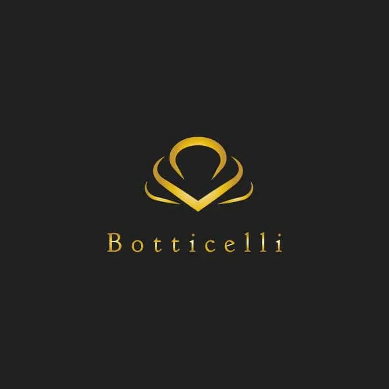
Botticelli
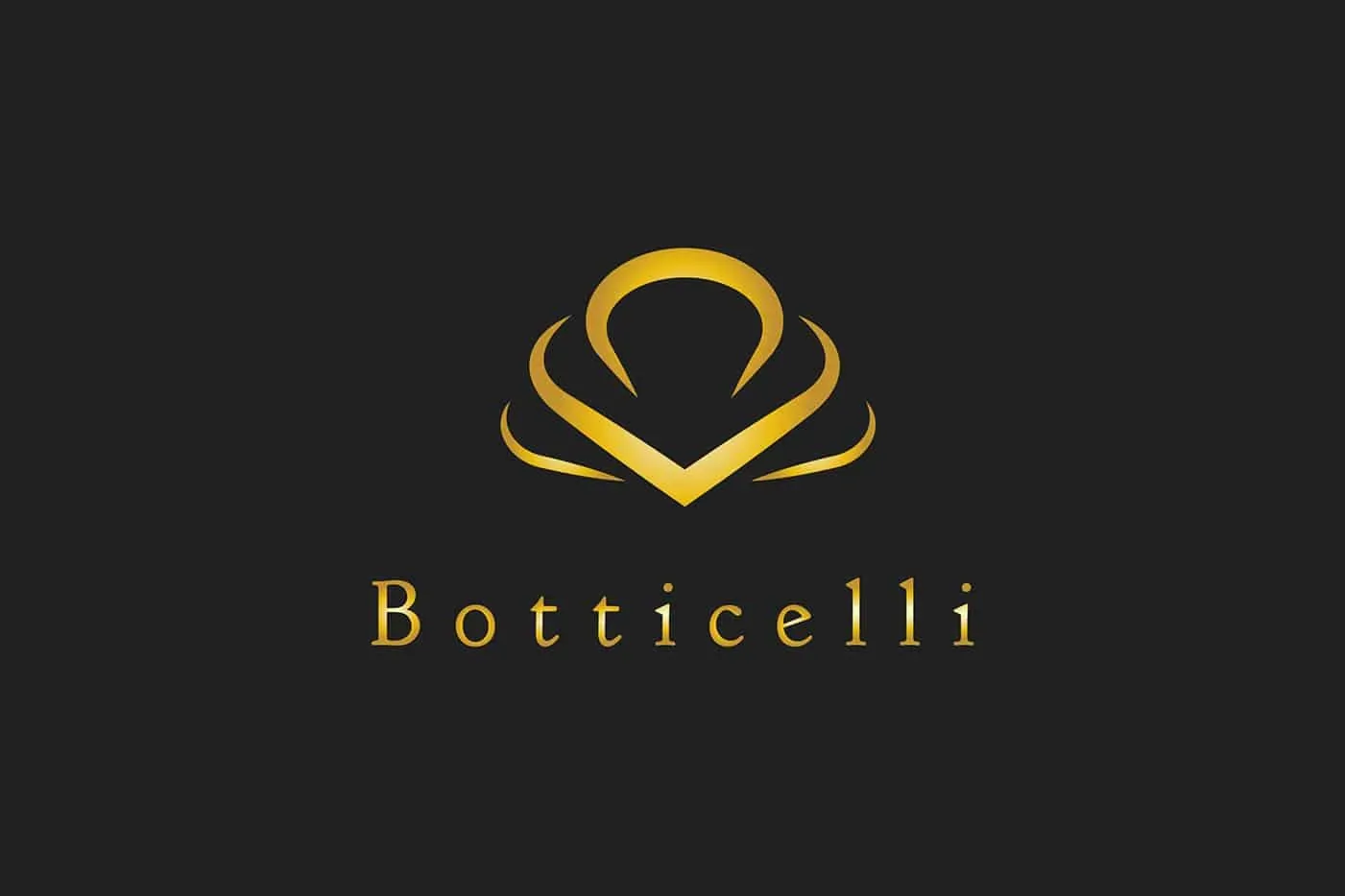
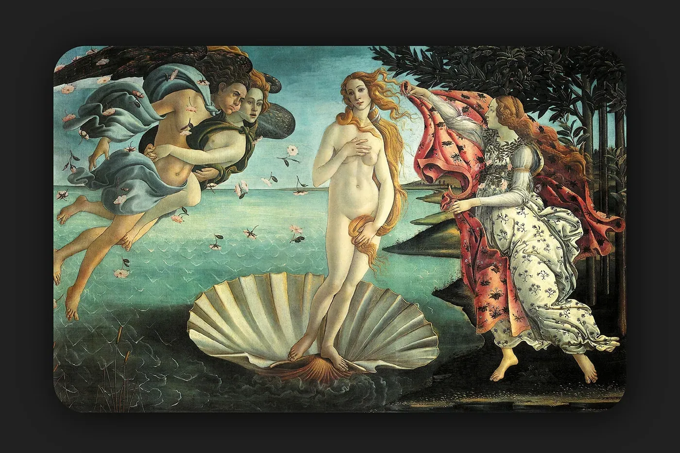
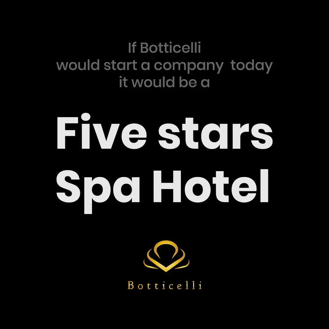
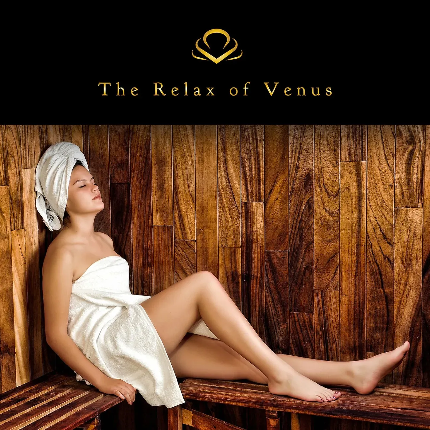
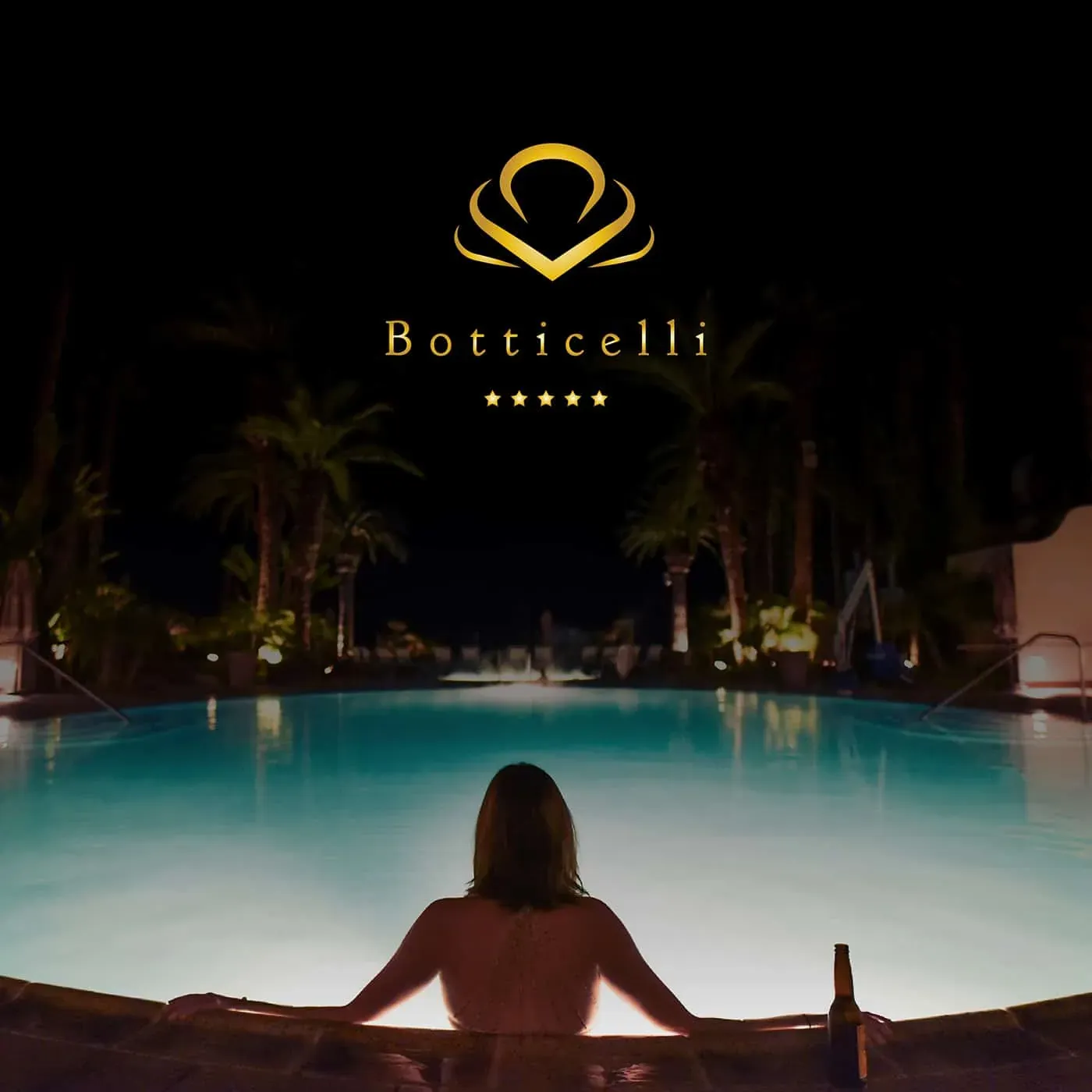
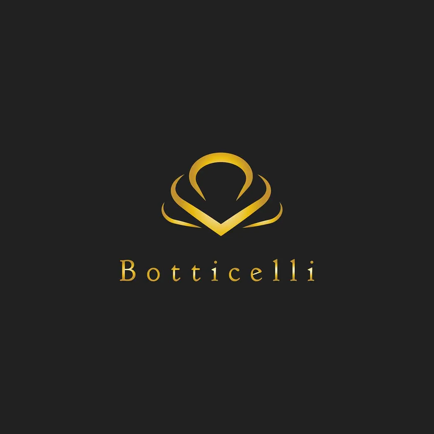
A hotel and spa for Botticelli, with a golden shell as its mark. The design takes the shell from The Birth of Venus and turns it into an emblem of rest and renewal.
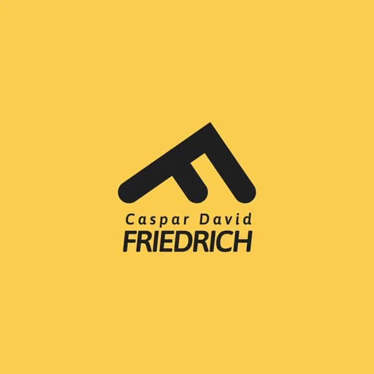
Caspar David Friedrich
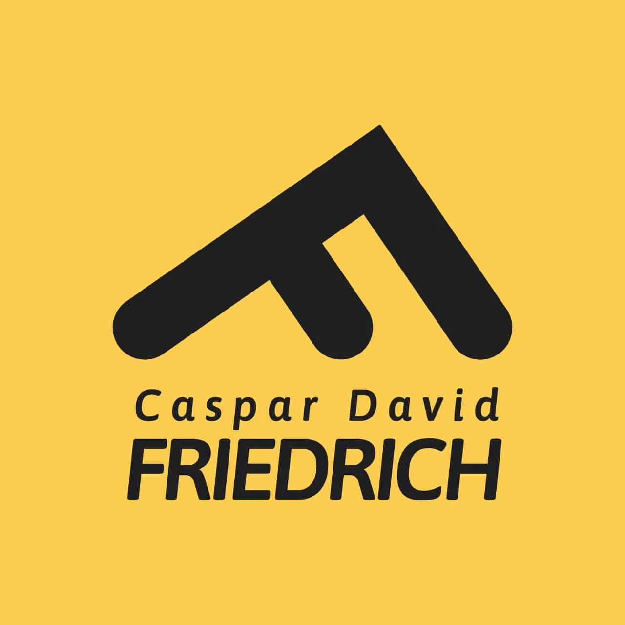
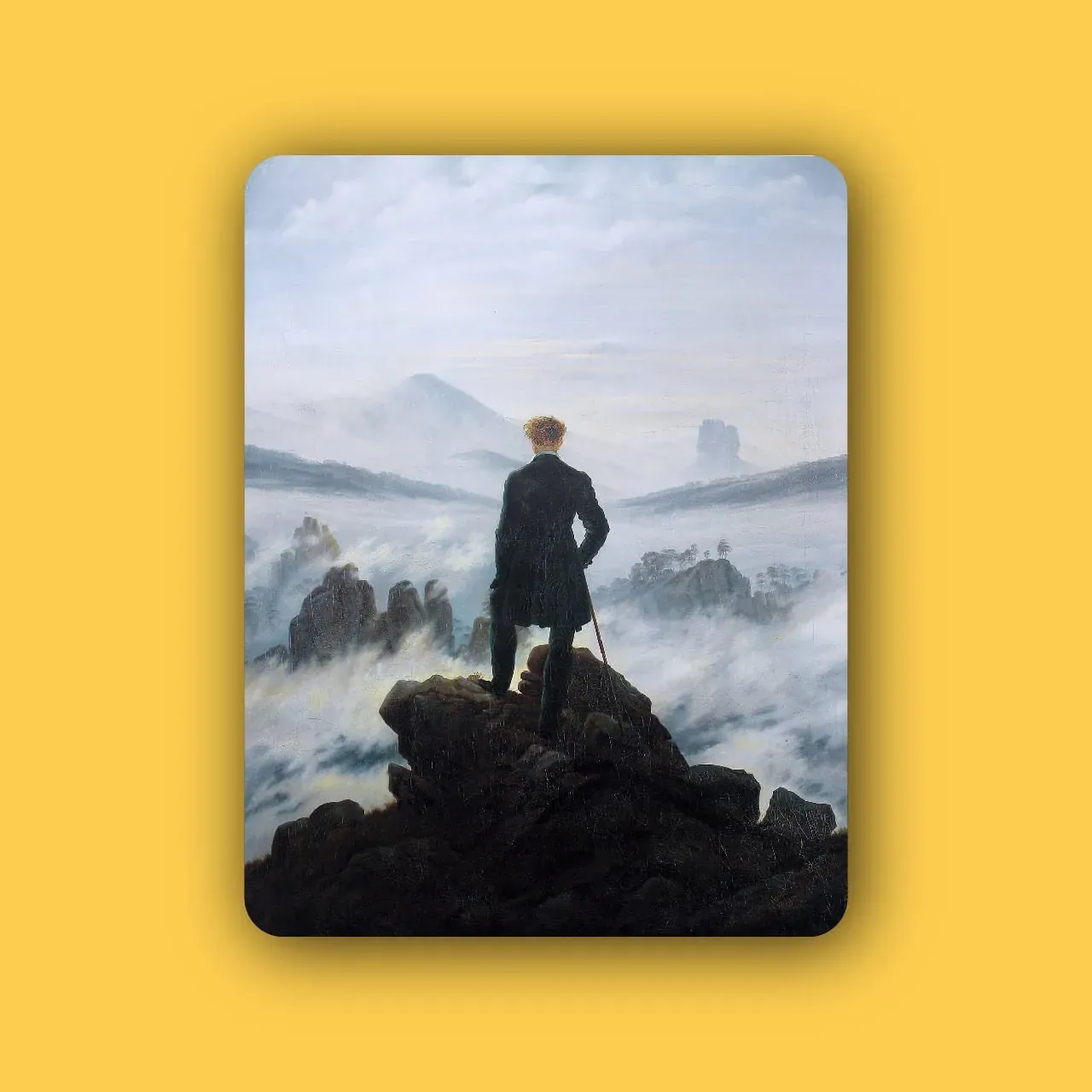
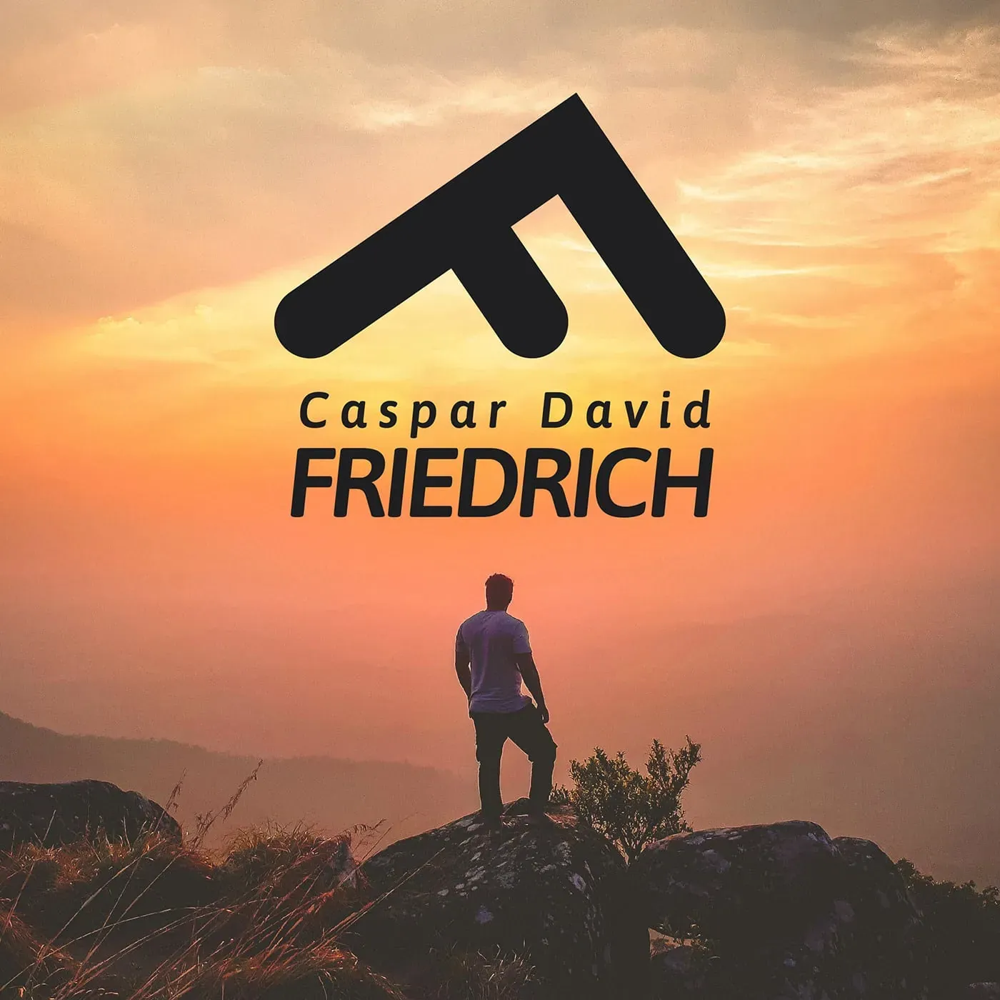
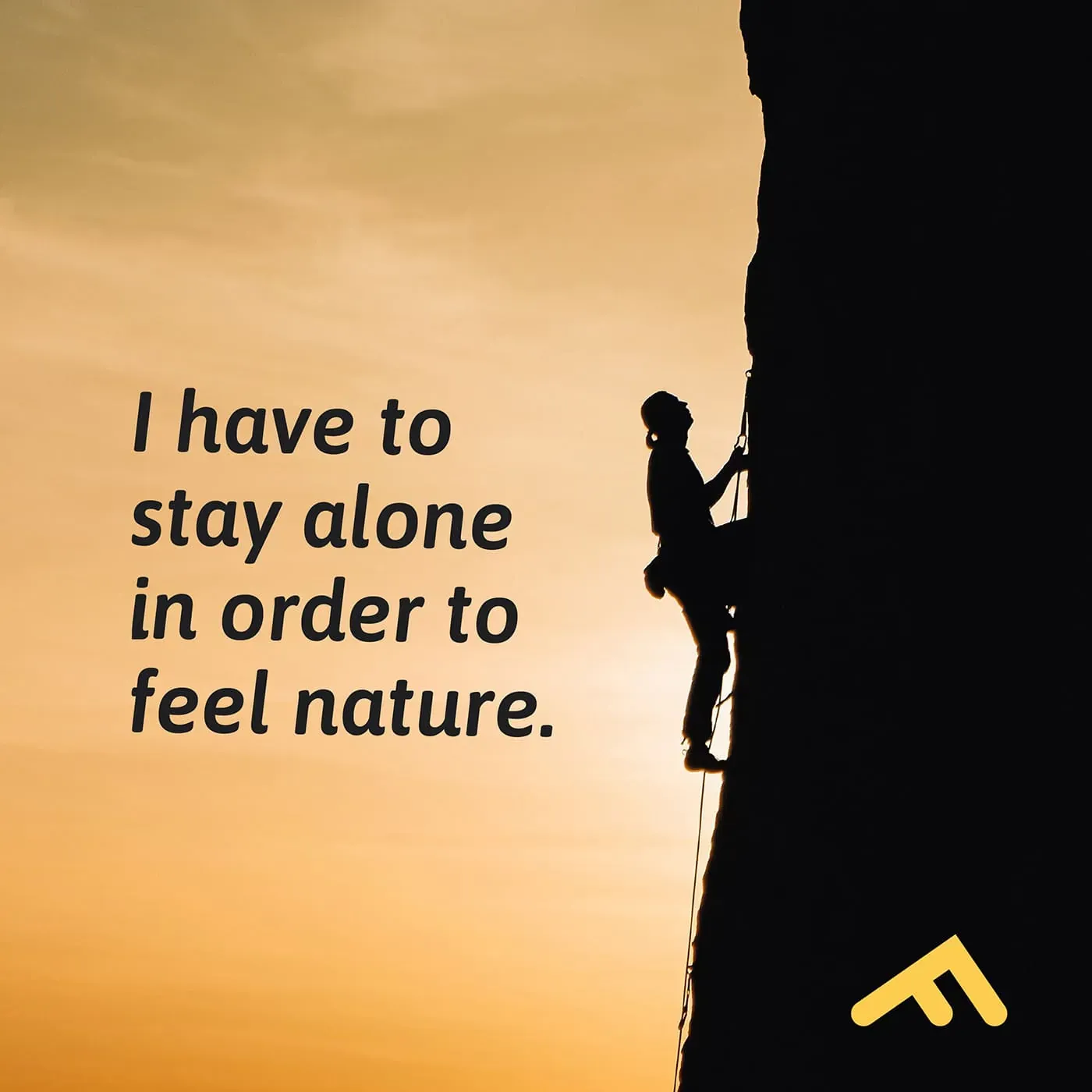
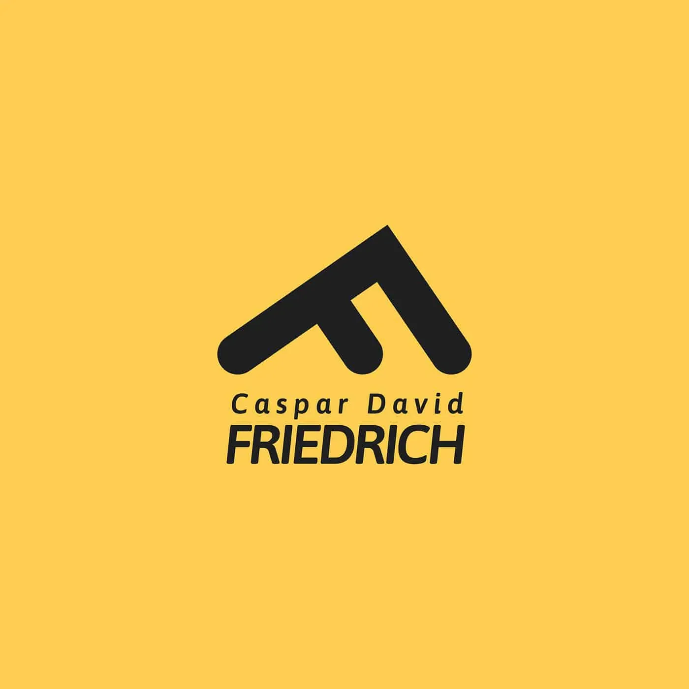
For Caspar David Friedrich, I imagined a climbing equipment brand. The letter F becomes a mountain, connecting the name with the dramatic landscapes that inspired the design.

Braque
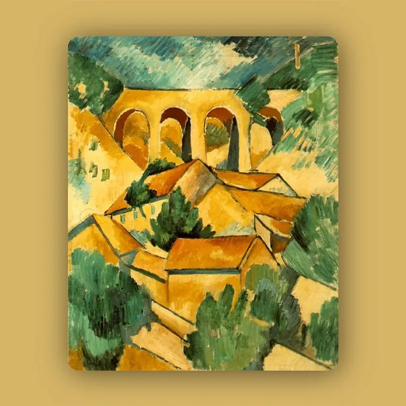
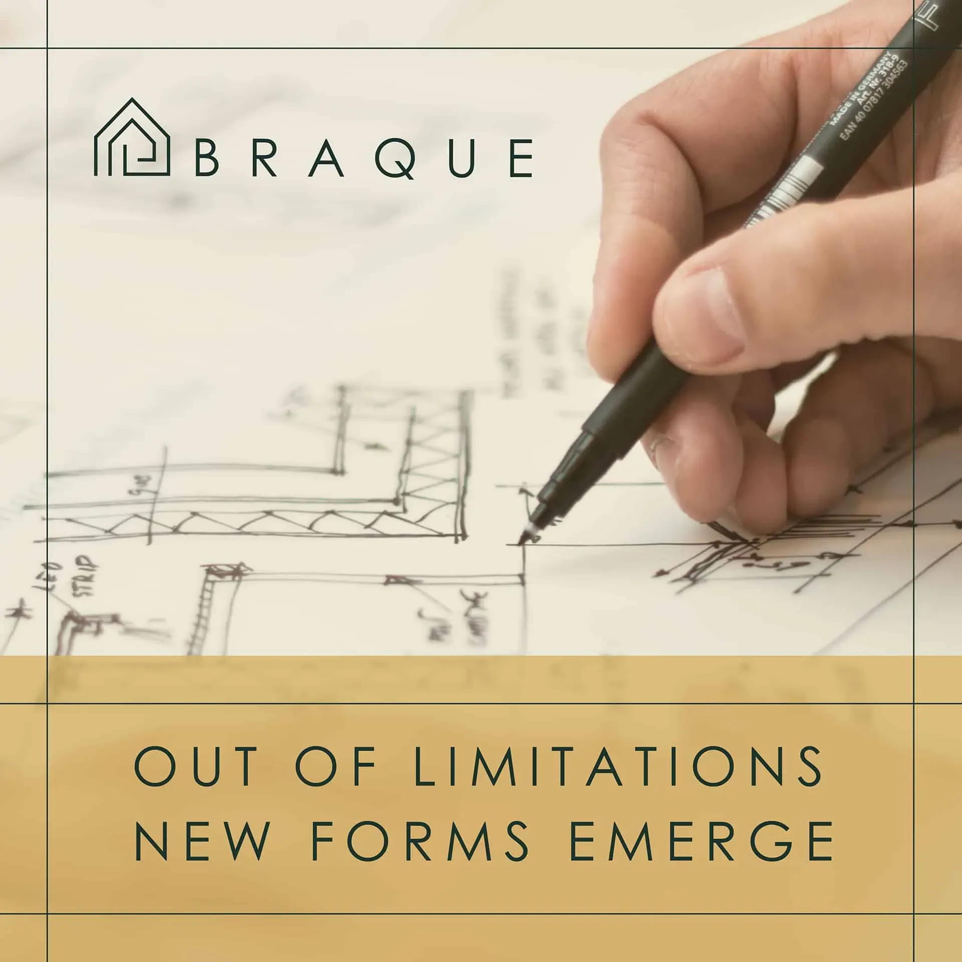
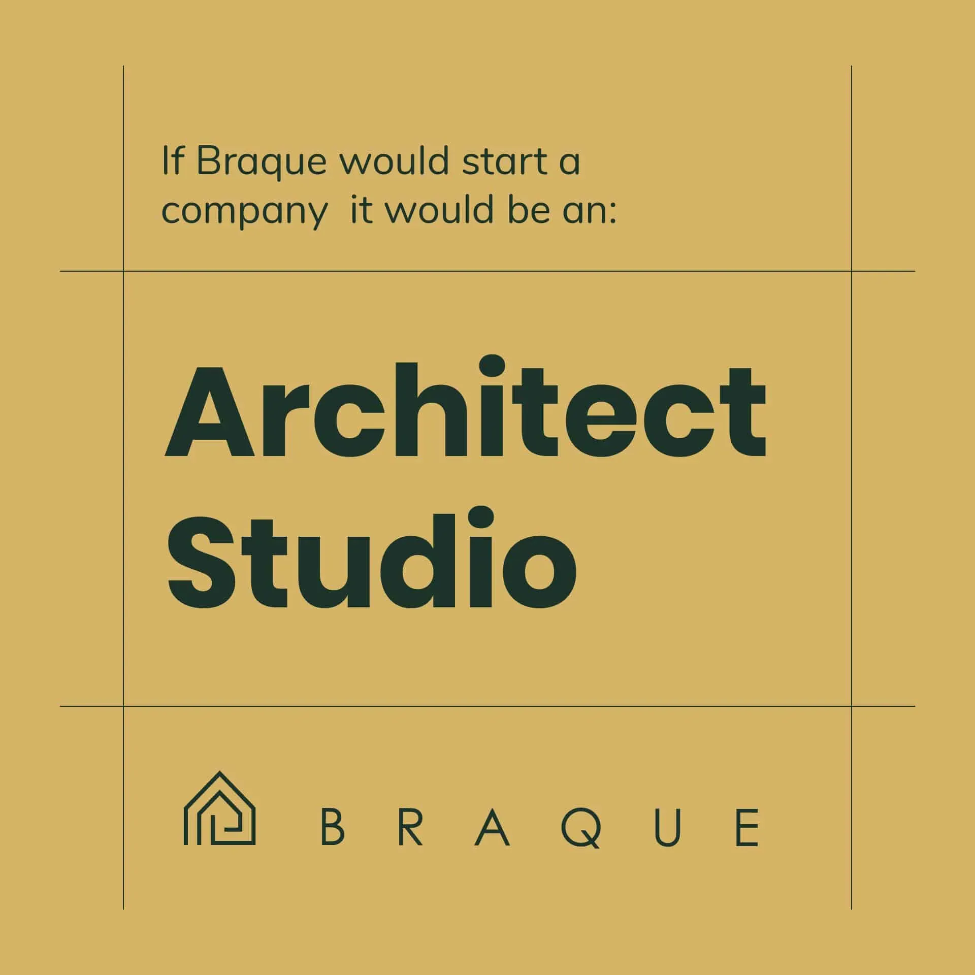
An architecture studio for Georges Braque, built around intersecting planes and simplified forms. The identity takes its starting point from the structures and geometry of Le Viaduc à L’Estaque.
John Baldessari
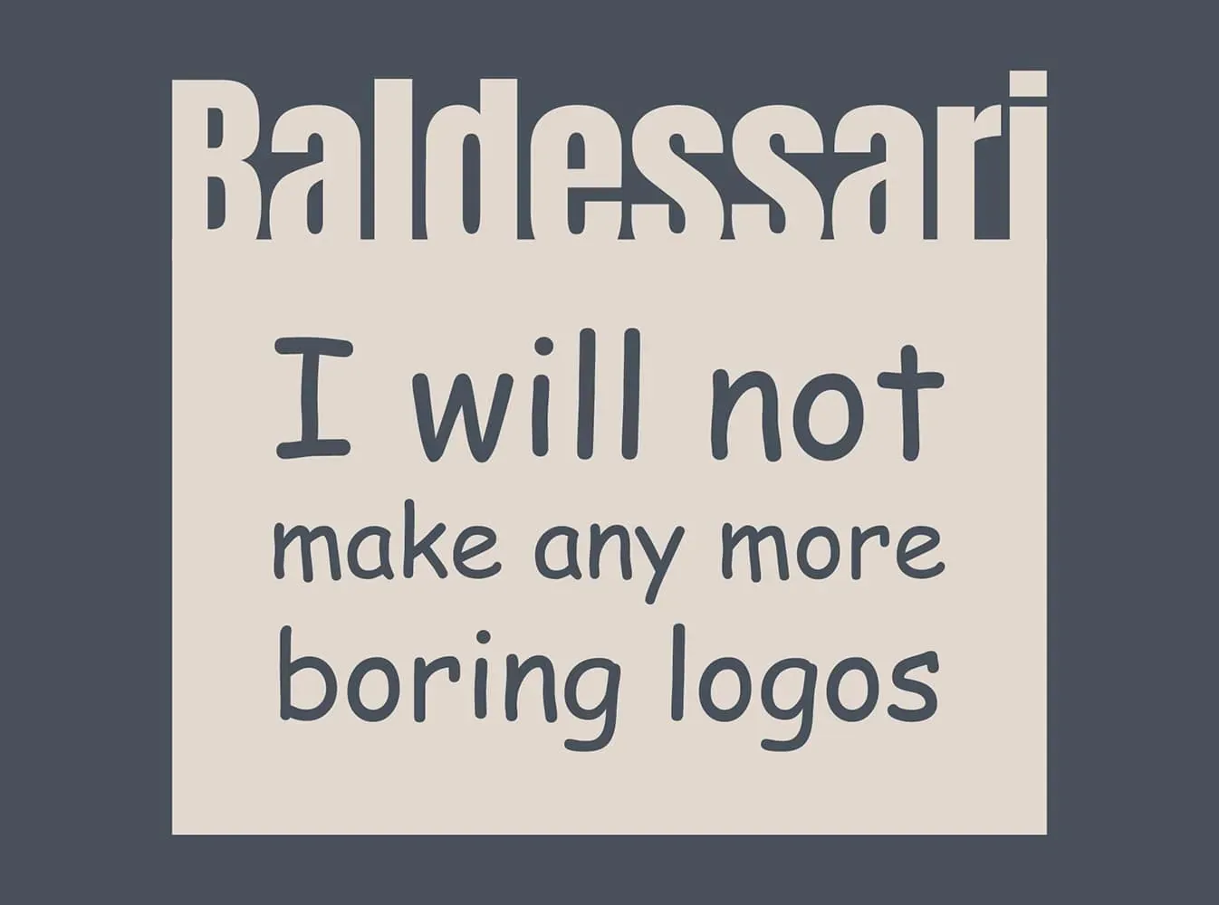
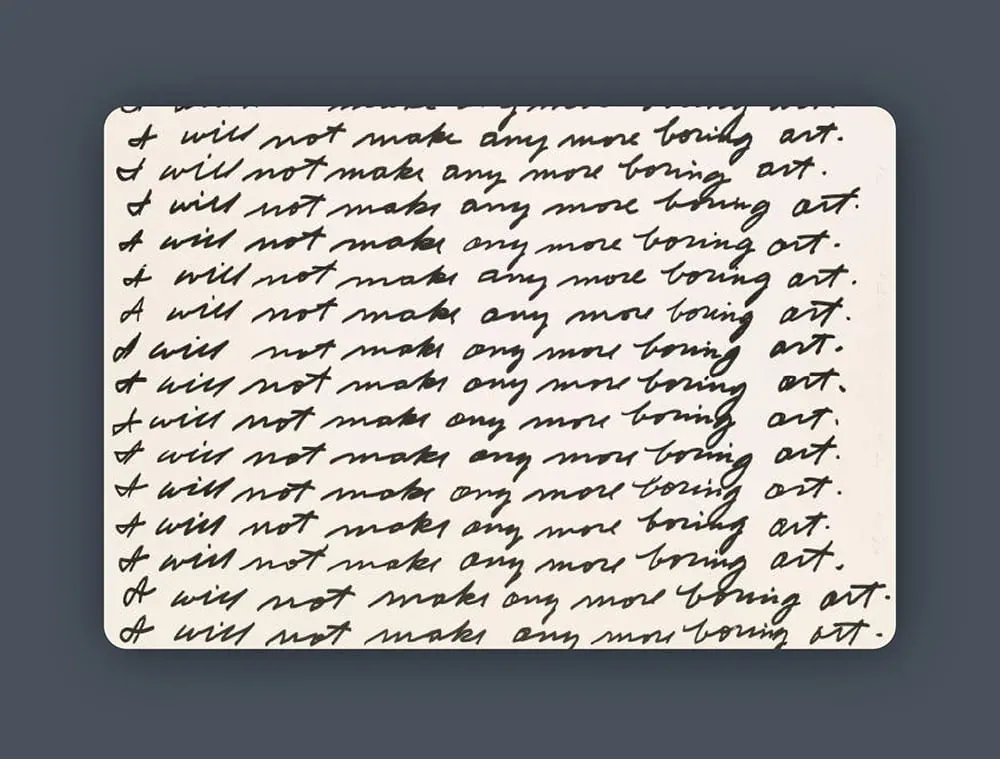
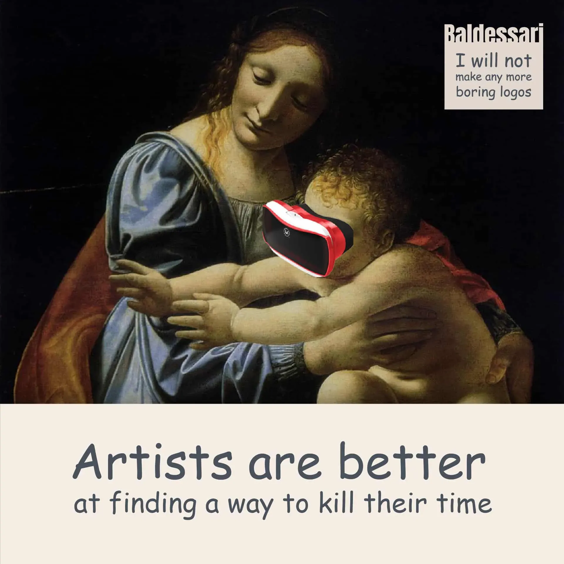
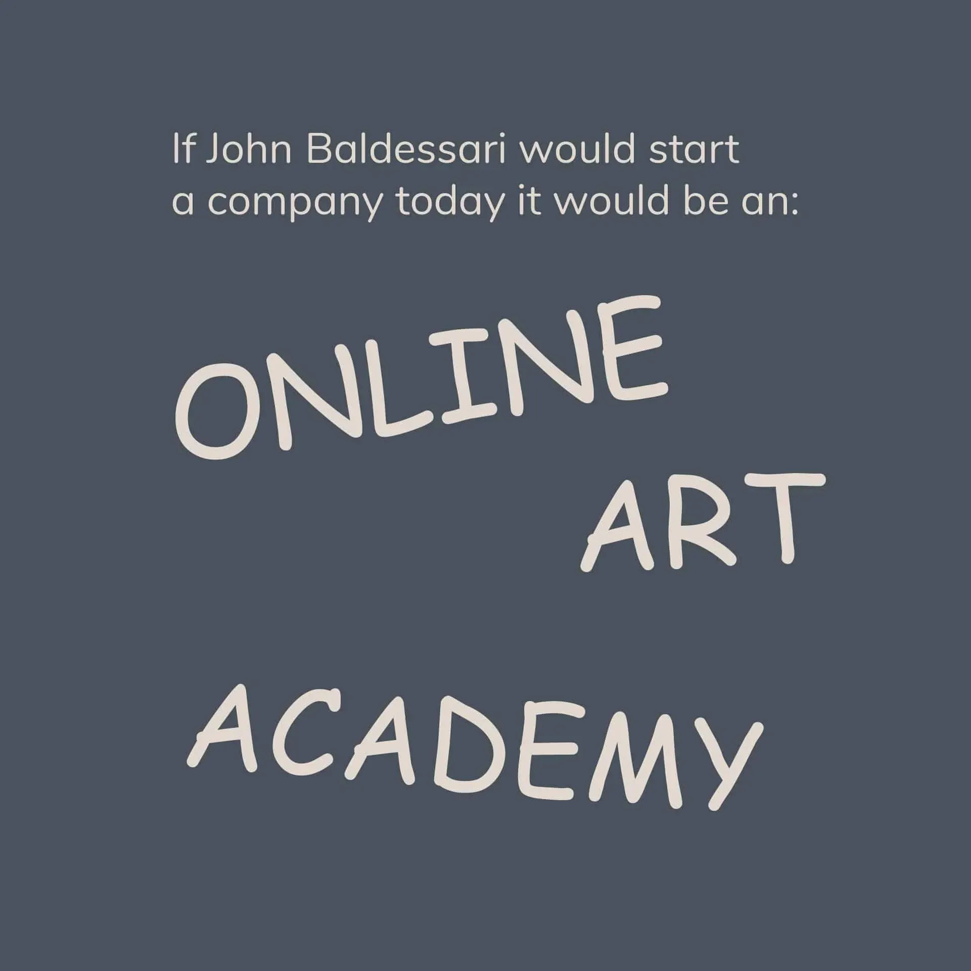
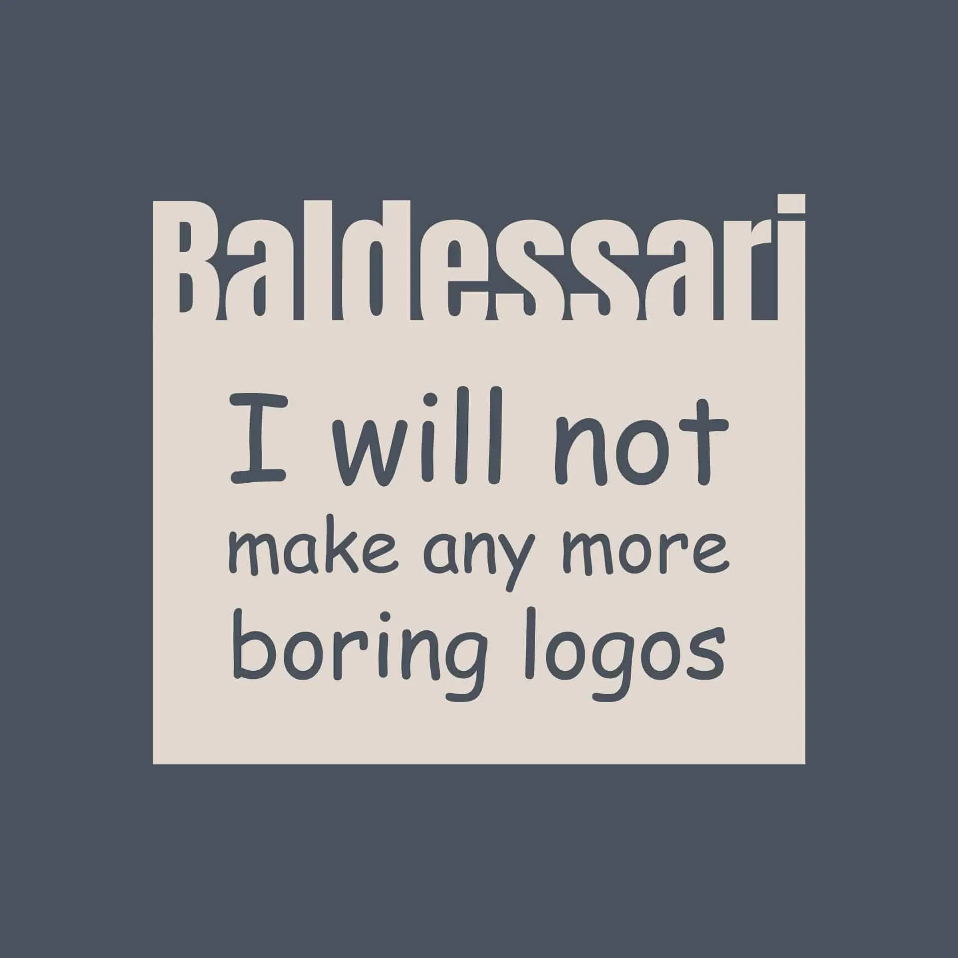
An online art academy for John Baldessari, with Comic Sans doing the serious work. The logo is a playful response to I Will Not Make Any More Boring Art, and a small act of disobedience towards good design manners.
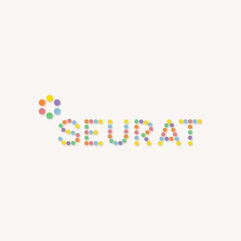
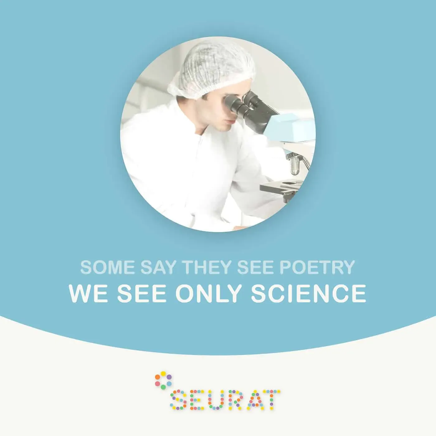
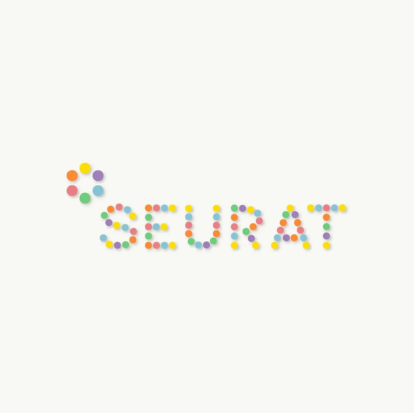
Seurat
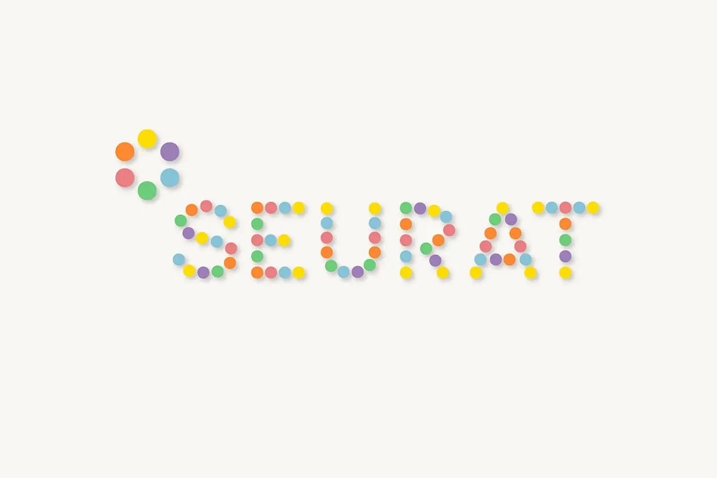
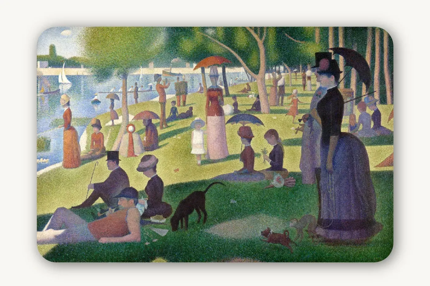
A scientific research company for Georges Seurat. The mark uses separate points of colour to build a larger image, turning the relationship between colour, perception and pointillism into a visual identity.

Botero
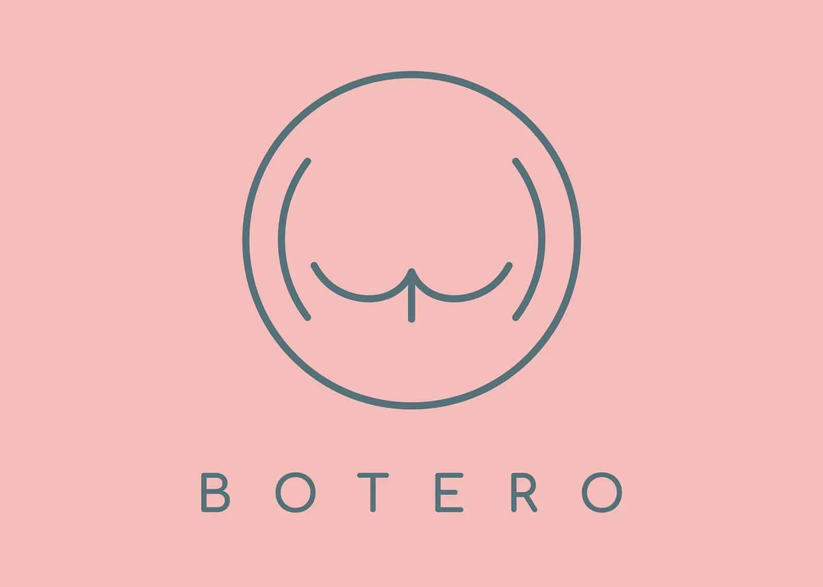
A weight-loss app for cats, imagined for Fernando Botero. The identity plays with rounded forms and volume, with a cat as its unlikely ambassador.
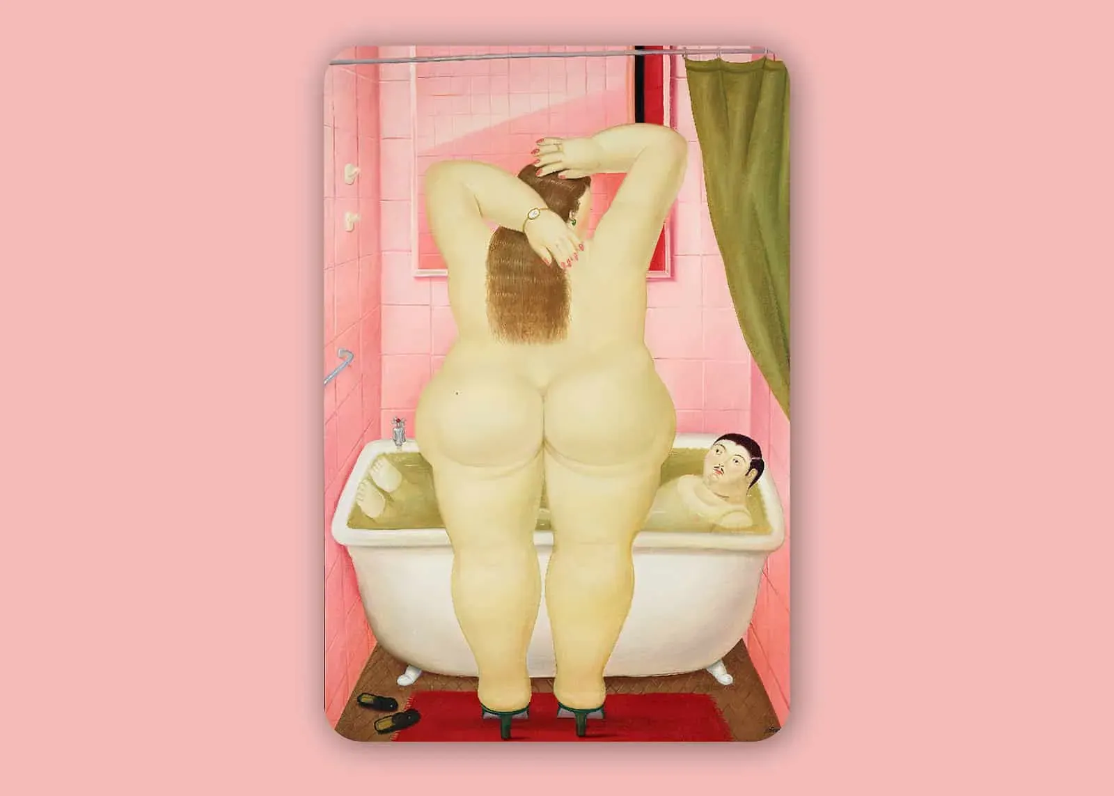
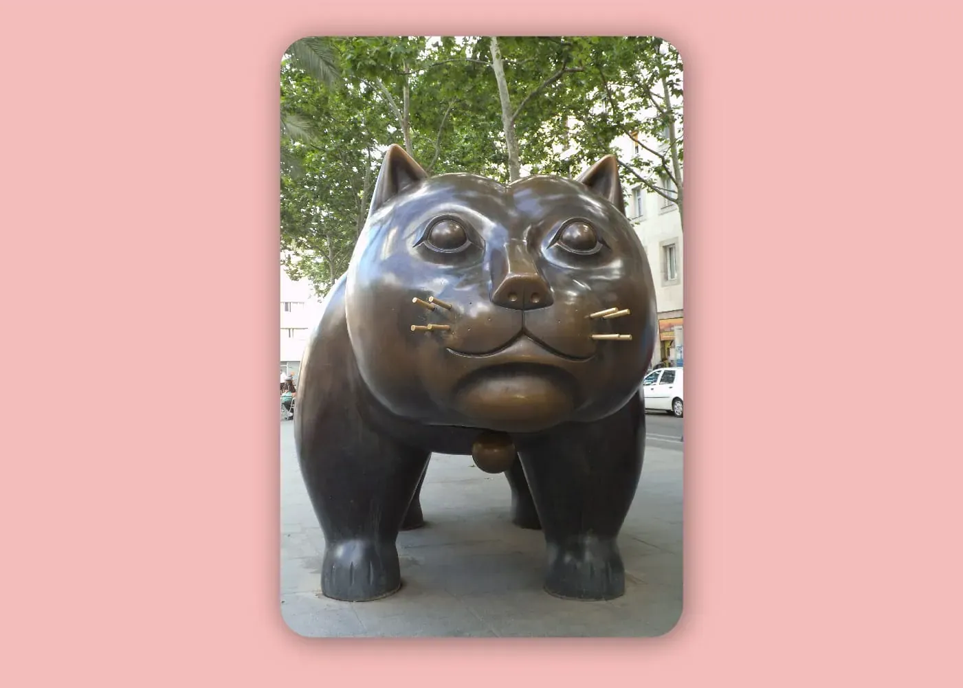
Inspired by The Bathroom and Botero’s cat sculptures.